Several moving parts here. I'll break it down into the key components, and then walk through building the viz one piece at a time.
First, you need to create an attribute that captures the concept of "Historical" vs. "Future". Do this by creating a calculated column like:
Type:=IF(sales[date] < TODAY(),"Historical","Forecast")
I'm just using current date to segment the data. Could easily hook this to a filter for an "as-of" date too. For now, we'll keep it simple.
The real challenge on this one is, to make the plotted line to be continuous, you need the last "Historical" value to actually fall into both buckets to make the lines overlap. Here's how to do it.
Create a calculated measure to give you the last date that is categorized as Historical:
LastDate:=CALCULATE(MAX(sales[date]),ALL(sales),sales[Type]="Historical")
Then create a basic SUM measure and then pivot out your 2 series of data into 2 separate calculated measures based on your SUM and factoring in the LastDate:
SumValues:=SUM(sales[value])

HistoricalSales:=CALCULATE([SumValues],FILTER(sales,sales[date]<=[LastDate]))

FutureSales:=CALCULATE([SumValues],FILTER(sales,sales[date]>=[LastDate]))
The key is the FILTER function that allows the overlap where the last date (because of the >= & <=) actually shows up in both series.
With those measures defined, you no longer need the Type attribute in the Series area of the chart. Just drop both measures (Historical and Future) into the Values area, and they will automatically be split into the 2 series lines you need.
In a pivot table, the resulting calculations should result in this:

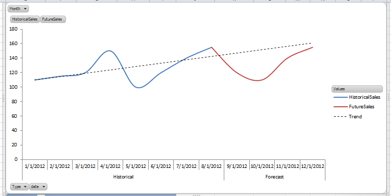
With that, you can simply configure your pivot chart like this:

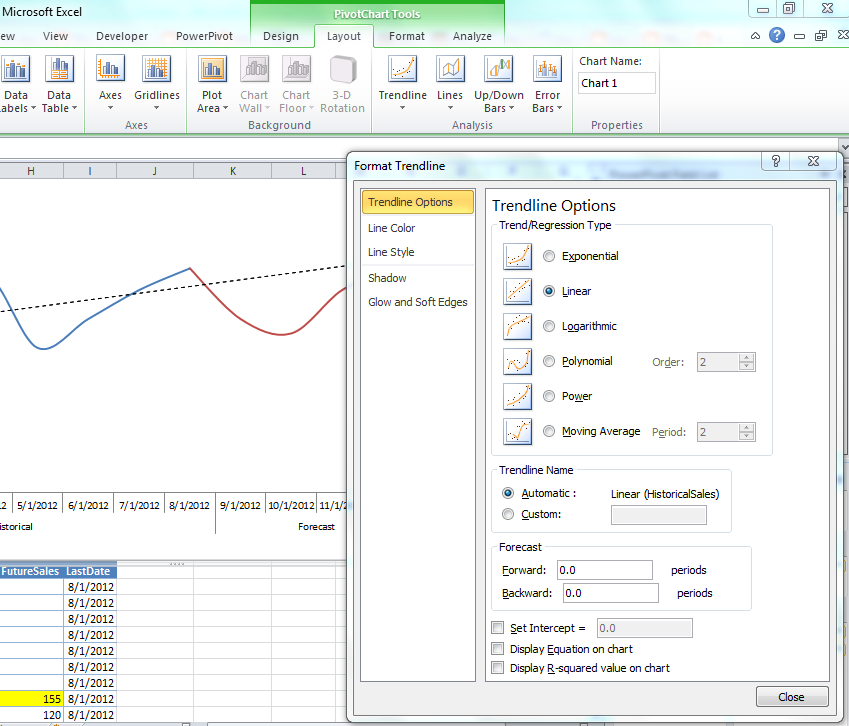
And then if you need the trend line, you can simply add it from the PivotChart - Layout tab:
And with that, you should have the finished product. Lot of ways to sexy pivotcharts up a bit more, but I'll leave that for another post...
I really like the trendline you created and the ideas behind it! I have followed with your instruction step by step till I stacked with create pivot chart. Would you like to give me detail information on how you crate the pivot chart from the pivot table? I am a beginer of Powerpivot so I want to have the mini-steps. Thank you very much!
ReplyDelete