Brent Greenwood's blog

Data & Analytics

Friday, November 23, 2012

PowerPivot Viz - Historical Sales Versus Forecast Continuous Line Chart


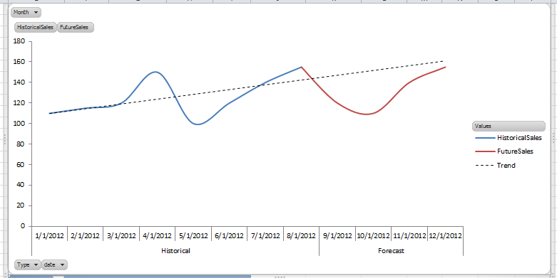
Had a requirement the other day to be able to visualize historical sales and forecasts in one continuous line chart.  Actually pretty simple in Excel.  And when you are working with a PowerPivot model and have the power of DAX at your disposal, it's even easier.


Read more »
Posted by Brent Greenwood at 11/23/2012 07:48:00 PM 1 comment:
Email ThisBlogThis!Share to XShare to FacebookShare to Pinterest
Labels: Data Visualization, DAX, Excel, PowerPivot
Newer Posts Older Posts Home
Subscribe to: Posts (Atom)

profile

My photo
Brent Greenwood
San Diego, CA, United States
View my complete profile

Pages

  • Home
  • About
  • Resources

search

labels

  • AS Tabular (2)
  • Business Intelligence (3)
  • Data Visualization (2)
  • Data Warehousing (6)
  • DAX (4)
  • Dimensional Modeling (5)
  • Dimensions (2)
  • ETL (2)
  • Excel (4)
  • Fact Table Design (1)
  • Integration Services (1)
  • Microsoft (4)
  • PowerPivot (6)
  • San Diego (1)
  • Slowly Changing Dimensions (1)
  • SQL Server (3)
  • SSAS (4)
  • SSIS (2)
  • Training (4)

archive

  • ►  2013 (5)
    • ►  April (2)
    • ►  March (1)
    • ►  February (1)
    • ►  January (1)
  • ▼  2012 (6)
    • ►  December (2)
    • ▼  November (1)
      • PowerPivot Viz - Historical Sales Versus Forecast ...
    • ►  June (1)
    • ►  February (1)
    • ►  January (1)
  • ►  2011 (5)
    • ►  December (3)
    • ►  November (2)
Simple theme. Powered by Blogger.